Article
How to design a website, step by step
A visual tour for beginners. You will leave with a page sketch, a small set of design choices, and a short list to test before you share the link.
Short answer: One clear action on the first screen, a short menu, readable type, real photos, and the same story on a phone.
This is for someone designing a first site. You do not need to write code to use it. The pictures are homepages from the portfolio: IS Auto Repairs, WehFiGo, Orchid Gold Interiors, Ritzy Tours JA, KHutton Collections, and PNTCOG. Tap a numbered dot to read what that part of the screen is doing. Drag the compare bar to switch between a wide screen and a phone.
By the end you will have a one-line goal, a box sketch of your homepage, and a short test list. The worksheets at the bottom are the same ideas on paper. If you want the same ideas as a 2-day course, start at Design Your First Website. A shorter note on taste is how I design websites that look premium and get customers.
The first screen has one job
Decide the one thing a new visitor should do: call, book, visit, buy, or send a note. Put that action on the first screen, in words a customer would say.
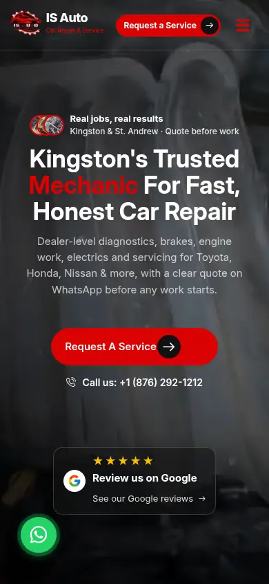
IS Auto leads with the repair offer and a red request button. The menu is there, but it does not compete with the button.
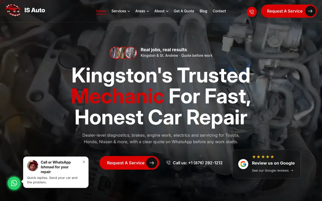
2. The action One strong button, repeated. It says what happens next, not "click here".
3. The promise The largest type is the offer. A visitor can read it before anything else.
4. Proof Reviews sit near the action so a careful person can check, then still see the button.
Ritzy Tours uses the same idea with a search bar. The headline names the service. The search is the action.
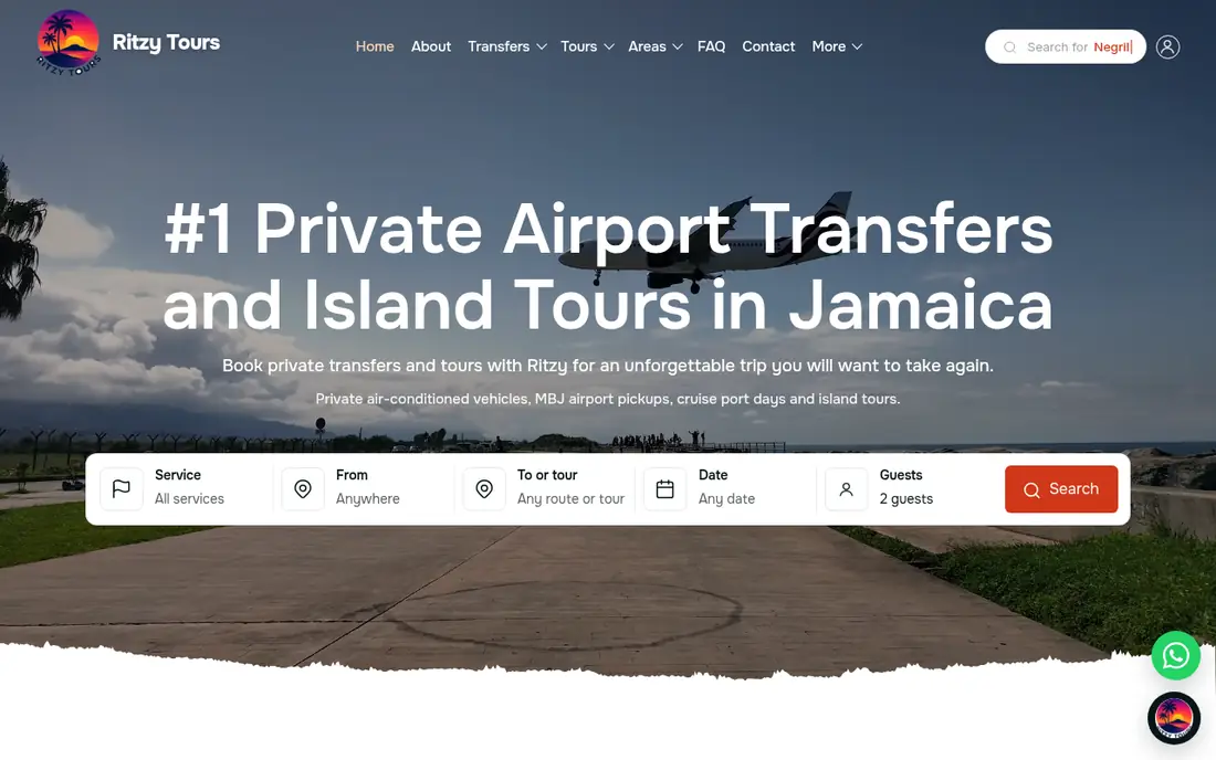
2. Headline Big type on a photo only works when the words stay bright and the photo stays quiet behind them.
3. The action The search bar is the next step: service, route, date, guests. One orange button.
Try this: Write one sentence: "When a new visitor lands, they should __." Sketch a box. Put that action in the box. Cross out any second button that can wait.
Keep the menu short and steady
The menu is a map. Same words on every page. Plain names beat clever ones.
PNTCOG puts a help line in a gold bar, then a simple menu: About, Events, Ministries, Contact. Home is marked so you know where you are.
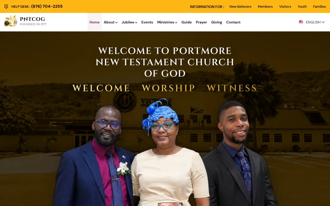
1. A utility bar A thin strip for people who already know what they need, such as visitors or members. It does not replace the main menu.
3. One voice The headline is the church name and welcome, set in a light face so it reads on the dark photo.
WehFiGo is busier because the product is a directory. Even then, the top row is a short list, and the search is the thing you are meant to use.
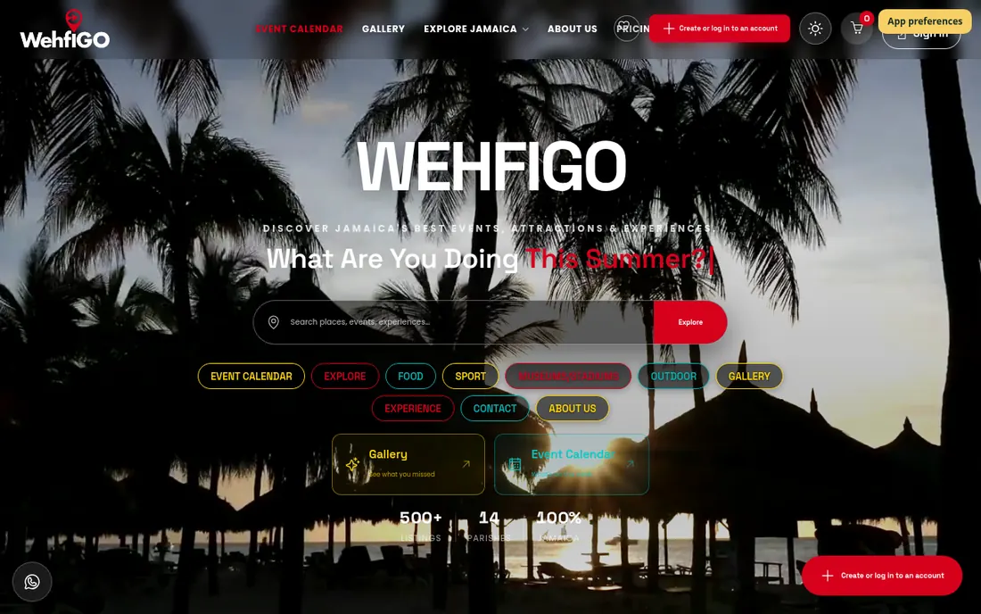
2. Search For a directory, search is the action. It is wide, and the button is a solid red.
3. Categories Outlined pills are a second way in. They share one shape so the row scans as a set.
Try this: List your menu in five words or fewer. If a label needs a joke to make sense, rename it.
Your website
Want this done for your business?
Tell me what you need in a few quick taps. You get a written quote before you pay anything.
Plan pages as rooms, then stack the homepage
You do not need many pages. You need the rooms that make the action possible.
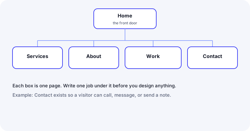
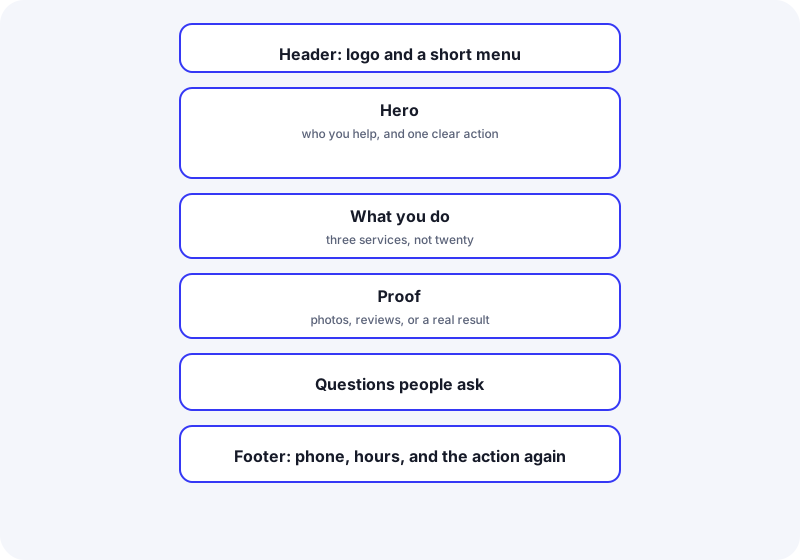
A homepage can hold the same rooms in a stack: menu, promise, action, what you offer, proof, a few questions, then phone and hours again.
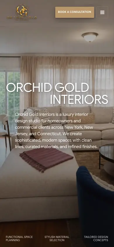
Orchid Gold shows that stack on a real screen: menu and a gold "Book a consultation" button, a huge name, a short paragraph, then three quiet labels along the bottom.
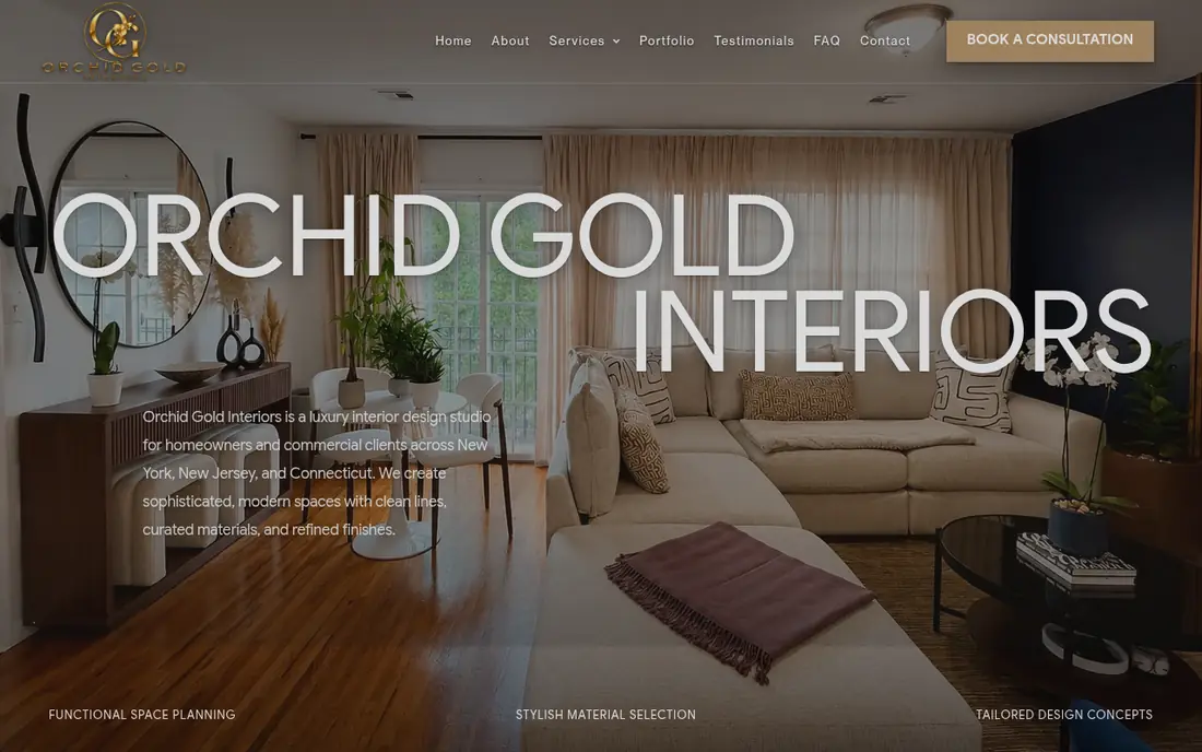
1. One button Gold, in the header, with words. The rest of the menu stays text.
2. Type as the picture The name is enormous and white, so it reads on the room behind it.
3. A short paragraph A few lines, not a history. Who it is for, and what they do.
Try this: On paper, draw seven stacked boxes for your homepage. Write one line in each. Leave a box blank if you do not have the words yet.
Color, type, and space
Use a few colors with jobs. Ink for words. Paper for the background. One color for the action. The brand color can be an accent if it is too pale for text.
WCAG 2.2 asks for a contrast ratio of at least 4.5:1 for normal text, and 3:1 for large text. Check pairs in the WebAIM contrast checker. The rule is written up by the W3C: contrast minimum.
Body text at 16px or larger stays readable and keeps phone fields from jumping. A line of text is easier under about 80 characters, which is the enhanced guidance in WCAG visual presentation. One or two type families are enough.
KHutton shows a quiet system: a script headline, a small capital line under it, a lot of dark space, and the bag as the proof.
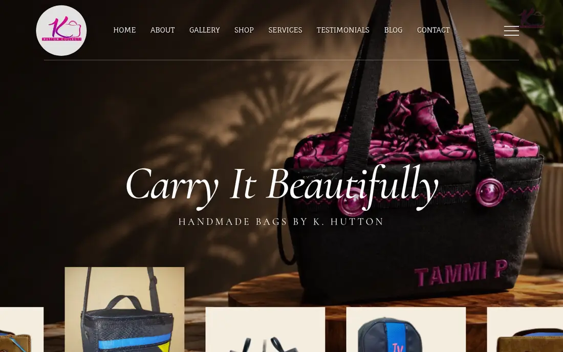
1. Two voices A script line for the feeling, then small capitals for the plain fact. The script is short. The explanation is not in script.
2. The product is the picture You see the bag, the cloth, the button. That is the proof.
Try this: Pick four roles: ink, paper, brand, button. Write them down. If the brand color fails as button text, keep it for the logo and choose a darker button.
Photos should prove something
Use a picture to show the work, the place, or the product. Export it near the size it will appear, then compress it. A free tool for that is Squoosh.
If the picture carries meaning, describe it in the alt text. If it is only decoration, use an empty alt. Do not set your headline as a picture of letters. MDN explains alt on the image element.
On the KHutton and Orchid screens, the photo is the evidence. The words sit beside it or on a quiet part of it. On IS Auto, the engine is atmosphere, and the headline does the explaining. Both can work. The words still have to be real text.
Try this: Pick three photos. Write one sentence of alt text for each. If you can only say "nice vibe", the photo is optional.
Design the phone screen first
The narrow screen is the real site. Same words, one column, the action easy to tap. WCAG 2.2 asks for a target of at least 24 by 24 CSS pixels. Make the main button larger than that. The note is here: target size.
Drag the bar. Left is the phone crop of the first screen. Right is the wide screen. Same IS Auto homepage.
PhoneWide screen
The phone version keeps the red button in the header and stacks the headline. The menu becomes an icon. Nothing important is deleted.
Orchid does the same: the consultation button stays, the name stacks, the paragraph fits the column.
Try this: Narrow your browser until it feels like a phone. If the action is gone, move it up. Do not shrink the type to force it.
Trust, then test
People act when they can reach you and when the page looks like a real business. Show the work. Use reviews you have permission to show. Put the phone and a short form in more than one place. If you collect names, say what you do with them. A plain privacy note is enough to start. This is not legal advice. See this site's privacy policy and the note on contact forms. For reviews, the careful version is how to ask the right way.
Before you share the link, do this on your phone:
- The action is visible without a hunt.
- The phone link opens the dialer. The form arrives in an inbox you read.
- Menu labels match the pages.
- Text is readable, including text on photos.
- Nothing slides sideways.
- You can tab to every button and see where focus is.
- Someone who is not you can finish the main action without help.
The same list is in the pre-launch PDF.
Try this: Hand your phone to one person. Stay quiet. Watch the first place they pause. Fix that.
A light note on being found
Design comes first. A few habits help people and search engines read the page. Google's SEO Starter Guide is the public reference.
Give each page its own title and one H1 that matches the promise. Describe images in alt text. Link your pages with words that say where they go. If customers visit you or you visit them, use the same name, address, and phone on the site and on your Google Business Profile. After launch, add the site in Search Console and submit a sitemap.
That is the whole lesson. The beginner SEO checklist PDF is the same list on paper. Do not stuff keywords, hide text, or buy links.
If the address itself is still open, how to choose a domain name is a separate short read.
Questions people ask
Can I design a site if I cannot write code?
Yes. The work in this guide is deciding the action, sketching the blocks, picking a few colors and one or two fonts, and testing on a phone. A builder lets you assemble that in a browser. A custom page is the same plan, written by hand in HTML and CSS. You can do the plan either way.
How many pages do I need?
Often home, services, about, proof, and contact. One long page is fine if those blocks still fit in a clear order. Add a page when someone needs a link to just that thing, such as a menu.
What should the first screen show?
The promise, one action, and a hint of proof. Look at the IS Auto and Ritzy screens above. The largest words say what you do. The button or search says what to do next.
How do I know the text is readable?
Check the text color against the background. Normal text should be at least 4.5:1. Look at it on your phone in daylight. If you are squinting, it is too faint.
What should I test before I share the link?
The action, the phone link, the form, the menu, and the phone layout. Then watch one other person try the main action without your help.
Do I need a video on the homepage?
No. A still photo of the real work is usually clearer and lighter. Use video only when the motion itself explains something.
Worksheets
Print these or mark them on a tablet. They are the same lessons, with space to write.
- Website planning worksheet (PDF)
- Pre-launch checklist (PDF)
- Color and font cheat sheet (PDF)
- 30-day post-launch plan (PDF)
- Beginner SEO checklist (PDF)
Check what you learned
If you want this done for you
You can design a clear site from the screens above. Sketch the first screen. Pick one action. Test it on a phone.
If you want someone who knows all the tricks and can do this, and more, for you, hire me. I design and build the site by hand. The portfolio is there if you want to look first.
If you want someone who knows all the tricks and can do this, and more, for you, hire me.
Your website
Want this done for your business?
Tell me what you need in a few quick taps. You get a written quote before you pay anything.

Let's work together
Want a written quote?
Message me with business type, parish, and whether you need booking or payments.