Day 1
Choose a few colors people can read
Give each color a job, and check that words clear the contrast minimum.
Transcript
Four jobs are enough: ink, paper, brand, and the action.
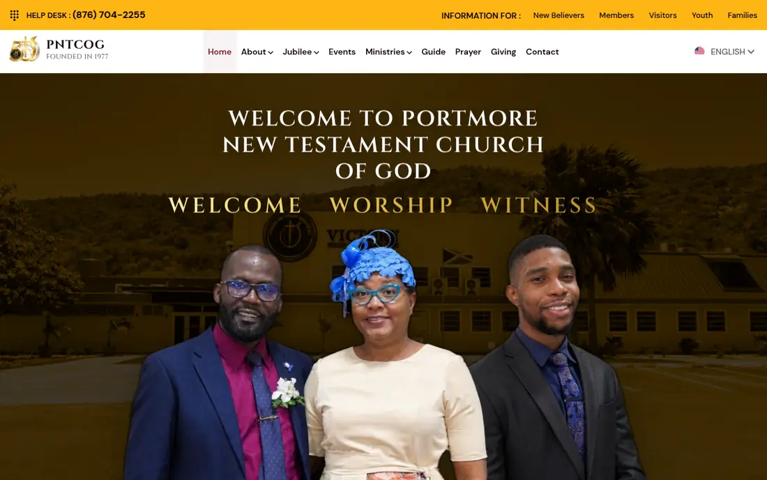
PNTCOG uses gold for the top bar and the welcome line, and light type on the dark photo so the name still reads.
WCAG 2.2 asks for at least 4.5 to 1 for normal text, and 3 to 1 for large text.
If the brand color fails as button text, keep it for the logo and darken the button.
Do not use color as the only sign that something is required or wrong.
Four jobs are enough: ink, paper, brand, and the action.
PNTCOG uses gold for the top bar and the welcome line, and light type on the dark photo so the name still reads.
WCAG 2.2 asks for at least 4.5 to 1 for normal text, and 3 to 1 for large text.
If the brand color fails as button text, keep it for the logo and darken the button.
Do not use color as the only sign that something is required or wrong.
Try this. Write your four color jobs. Check the button label against its background.
Let's work together
Want a written quote?
Message me with business type, parish, and whether you need booking or payments.